Entry 16 · Colour
The Neutral Patch
The grey square is the important one on the chart. Everything else is a check.
- Entry
- 16
- Section
- 04 Colour
- By
- Clare Dunnet
- Read
- 3 min
What the neutrals are doing
A colour chart has eighteen or twenty-four or more patches, and most of them are vivid: the reds, greens, blues, cyans, the skin tones. They are there to verify that hues land where they should — that your camera's colour matrix is accurate, that your colour space transform is honest. But the patches that do the quiet, essential work are the ones that contain no hue at all.
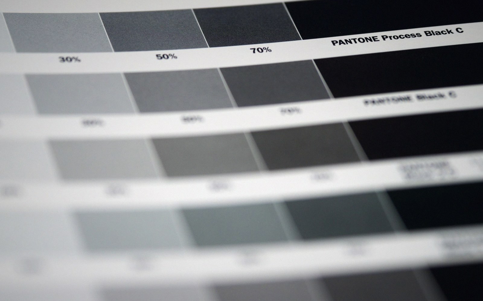
The neutral row is a strip of grey squares running from near-black to near-white. On the X-Rite ColorChecker Classic — the chart that has been a production standard since Macbeth made the original in 1976 — that row occupies the bottom strip: six patches stepping from a dark neutral through middle grey to a near-white. Their reflectances are specified in relative terms, the darkest absorbing most of the light, the lightest returning the majority of it. The middle patch sits close to 18 percent reflectance, which is also what the grey reference sphere is calibrated to.
The reason these patches matter more than the rest is simple: a neutral surface, by definition, reflects all wavelengths equally. It has no preference. If your pipeline is handling colour correctly — if the camera's white balance is accurate, if the colour transform is not introducing a cast, if the display is calibrated — a neutral patch must come out neutral. Equal R, equal G, equal B. Any deviation is a cast, and the cast tells you exactly what is wrong.
Reading the cast
When you sample a neutral patch in a correctly lit, correctly processed image, you are looking at a summary of every colour-handling decision made upstream of that moment. If the value reads (0.51, 0.50, 0.49) in linear light, something is warm. If it reads (0.48, 0.50, 0.53), something is cool. The magnitude of the deviation tells you how severe the error is; the direction tells you where to look.
This is why white balance is a choice shows up so legibly in the neutral patches before it shows up anywhere else. A saturated red swatch can absorb a surprising amount of white-balance error before it looks obviously wrong, because your eye has no absolute reference for that red. But you do have an absolute reference for grey: it is grey, and it is not supposed to be anything else. The neutral patch is the most sensitive diagnostic tool on the chart.
The same logic applies when building a linear and display pipeline. If you sample the neutral patches at the point where scene-linear values enter a display transform, they should still be achromatic. If they are not, the transform itself has introduced a gamut or white-point error. Catching that before the vivid patches makes the problem legible; the vivid patches would have hidden it.

What the rest of the chart cannot confirm
The colour patches verify the shape of the colour response — whether hues rotate, whether saturation is being crushed or expanded, whether the matrix is reasonable. They cannot tell you whether your white point is correct, because every hue patch is defined relative to the illuminant you chose. You can have a perfect hue response and a pronounced blue cast simultaneously, and the colour patches will not catch it cleanly.
Only the neutrals will. This is the deeper point: colour accuracy and neutral accuracy are independent properties of a pipeline, and it is possible to have one without the other. A camera profile built from a chart shot under the wrong illuminant, then corrected for hue but not for white point, will pass a rough visual inspection of the colour swatches and fail the neutral row immediately.
The practical consequence for image work is that when you receive any reference chart — whether it was shot on the day against a physical checker or derived from a measured illuminant — you check the neutrals first. You align the neutral row, you verify that the cast is gone, and only then do you look at the rest of the chart with any confidence. What the colour patches can tell you is real and useful, but it is conditional: it is only true once the neutrals are correct.
The neutral row is a strip of grey squares running from near-black to near-white.
The grey square is not the boring patch. It is the one doing the hardest checking.

More in Colour
Every entry in this section is listed on the Colour page, and all twenty-four sit in the full register.